Table of Contents
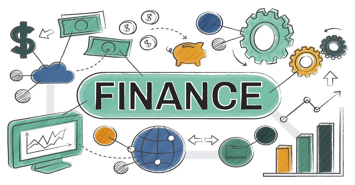
What Is a Visualisation Diagram?
Digital marketing uses lots of data. But this data can be confusing without the right tools. So, what is a visualisation diagram? It’s a way to turn numbers and information into pictures like charts or graphs. These pictures help marketers see important patterns in the data, making it easier to understand.
⇒ Why Visualisation Diagrams Matter in Digital Marketing
The purpose of a visualisation diagram is to make data easier to understand. Marketers often look at data from many sources, like website visits, social media, or ads. This data helps them figure out what’s working and what’s not. Visualisation diagrams help them see the big picture fast. For example, they can quickly spot if traffic is growing or if a campaign is doing well.
In this post, we’ll explore what visualisation diagrams are by looking at different examples. You’ll learn about line charts, pie charts, heat maps, and more. Each one has a special purpose and will help you understand how to use them in digital marketing.
The Role of Data in Digital Marketing
Why Data Is Important in Marketing
Data is very important in marketing because it helps marketers make smart decisions. Whether you’re checking how many people visit your website or how many likes you get on social media, data tells you what’s working. But when you have lots of data, it can get tricky to understand.
The Challenge of Understanding Data
If you’re looking at data without a visualisation, like a list of numbers, it can be hard to make sense of it. Numbers alone don’t always tell you the full story. This is where visualisation diagrams help. Without these diagrams, you could miss key information, like a steady rise in traffic over time, which could be easily shown in a visualisation diagram.
How Visualisation Diagrams Make Data Easier
Visualisation diagrams turn numbers into pictures, like graphs and charts. This makes it easier to understand patterns and compare information. For example, using a visualisation diagram like a bar chart can help you quickly compare how different ads are performing. Instead of looking through lots of numbers, you can see which ad is doing better in just a glance.
Key Types of Visualisation Diagrams for Digital Marketing
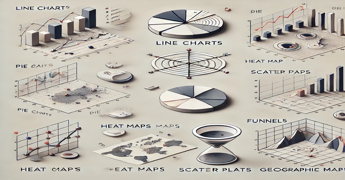
There are many types of visualisation diagrams. Each one is used for a different reason. Let’s look at some popular ones used in digital marketing.
A. Line Charts
Line charts are good for tracking changes over time, like how your website traffic or sales are growing.
- Example: A line chart can show how your website traffic changes from one month to the next. You can easily see if it’s going up, staying the same, or going down.
Line charts are easy to read and help you see patterns quickly.
B. Bar Charts & Column Charts
Bar charts and column charts are great for comparing different things, like how different ads or social media platforms are doing.
- Example: You can use a bar chart to compare how well your ads on Facebook, Instagram, and Twitter are performing. This helps you see which platform gets the best results.
These visualisation diagrams are helpful because they make it easy to spot which category is doing the best.
C. Pie Charts
Pie charts are useful for showing how much each part makes up the whole. They are great for showing percentages.
- Example: A pie chart can show where your website traffic comes from, like search engines, social media, or direct visits. This way, you can see which source brings in the most traffic.
Pie charts work best when you have just a few categories to compare.
D. Heat Maps
A heat map shows where people are clicking or scrolling on your website. It helps you understand how visitors use your site.
- Example: A heat map can show you which parts of your homepage people click on the most. This helps you move important buttons, like a “Buy Now” button, to places where people click more.
Heat maps are a great way to improve your website and get more people to take action.
E. Scatter Plots
Scatter plots show how two things are related. For example, they can show if spending more on ads increases sales.
- Example: A scatter plot can show how your ad spend is connected to your sales. If the dots on the graph go up, it might mean spending more money on ads increases sales.
This type of visualisation diagram helps you figure out what’s working in your marketing strategy.
F. Funnels
Funnel diagrams show how people move through steps in the sales process. They are useful for figuring out where customers are dropping off.
- Example: A funnel diagram can show how many people add an item to their cart and how many finish the purchase. If lots of people are dropping off before they pay, you know you need to improve the checkout process.
Funnels help you understand where to improve your sales process.
G. Geographic Maps
Geographic maps show data by location. This is helpful when you want to know where your customers or visitors are coming from.
- Example: A geographic map can show which countries or regions bring in the most traffic to your site. If one area is doing better, you might focus more marketing there.
These maps are useful if your business reaches people in different places.
Best Practices for Using Visualisation Diagrams in Digital Marketing
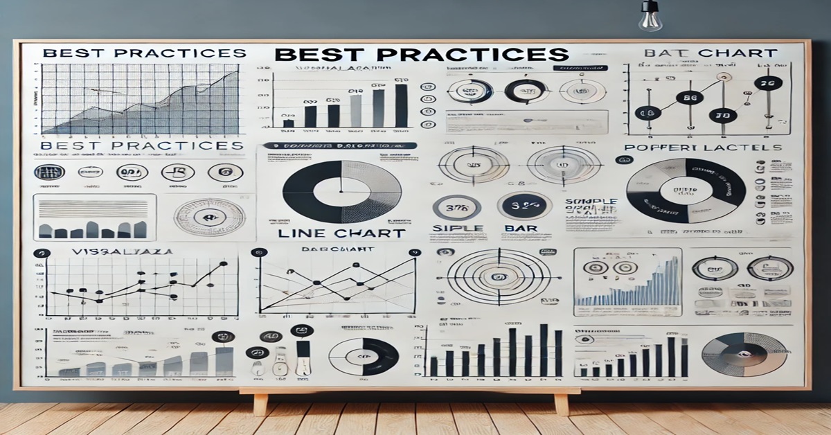
Using visualisation diagrams is helpful, but they need to be used correctly. Here are some tips to make sure your diagrams are clear and easy to understand.
How to Choose the Right Diagram for Your Data
Choosing the right diagram depends on the data you’re working with. For example:
- Line charts are great for showing changes over time, like monthly traffic.
- Bar charts work well when comparing different things, like how well ads are performing on different platforms.
- Pie charts are perfect for showing how something is divided, like where your traffic is coming from.
If you choose the wrong diagram, your data might be confusing. Always pick the type of diagram that matches what your data is trying to say.
Avoiding Common Mistakes
Even though visualisation diagrams can help a lot, mistakes can make them hard to read. Here are some things to avoid:
- Too much information: If you try to show too many things at once, your diagram can get messy. Keep it simple and focus on the most important data.
- Misleading scales: Make sure the sizes on your graph or chart are accurate. If they’re not, people might misunderstand your data.
- Cluttered visuals: Too many labels or colours can make it hard to understand. Stick to a clean design so your diagram is easy to read.
Design Tips for Effective Visualisation Diagrams
Good design makes your visualisation diagrams clearer and more helpful. Here are some tips:
- Use colour wisely: Colour can help highlight important parts of your data, but don’t use too many colours. Stick to a few colours that make sense.
- Label clearly: Make sure the labels on your diagram are easy to read. They should explain what the different parts of the diagram mean.
- Keep it simple: Simple diagrams are often the best. Don’t add extra things that distract from the main message of your data.
Using Diagrams to Tell a Data Story
Visualisation diagrams are great for telling stories with data. If you think of your data as a story, it’s easier for others to understand it.
- Start with a question: What is your data trying to answer? For example, “Which social media platform brings in the most sales?”
- Highlight key points: Use your diagram to show the most important things, like which platform is doing the best.
Use more than one diagram: Sometimes, one diagram isn’t enough to tell the whole story. Use a few different diagrams to explain different parts of your data.
Case Studies: Visualisation Diagrams in Action
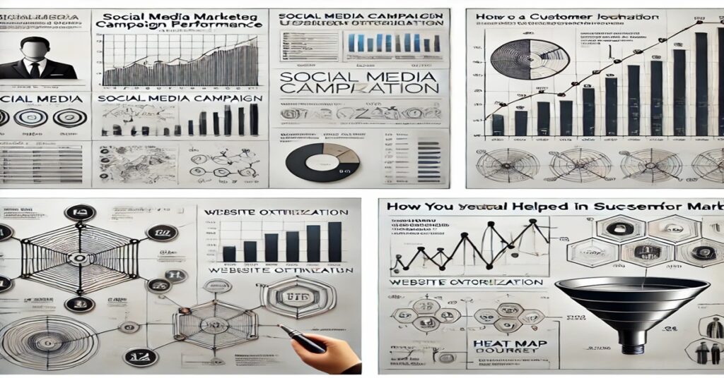
Let’s look at some real-life examples of how visualisation diagrams helped businesses improve their marketing.
⇒ Case Study 1: Using Line and Bar Charts to Track Campaign Performance
A marketing agency was running ads for a client on Facebook, Instagram, and Twitter. They used line charts to track how many people were engaging with their posts over time. This helped them see which platform was doing the best.
They also used bar charts to compare the click-through rates (CTR) of the ads on each platform. This allowed them to see which platform was giving the best return on investment (ROI). With this information, they focused more on the top-performing platforms, which helped improve the client’s overall marketing results.
⇒ Case Study 2: Heat Maps for Website Optimisation
An online store wanted to improve its sales. By using heat maps, they discovered that most visitors were clicking on images instead of the “Buy Now” buttons. This was a problem because the buttons were too far down the page.
After seeing this on the heat map, the store moved the buttons higher up on the page where people could see them better. This small change led to a big improvement in sales. The heat map helped them make a simple change that made a big difference.
⇒ Case Study 3: Funnel Visualisation for Sales Growth
A company selling products online was getting lots of website visitors, but many were not completing their purchases. By using a funnel diagram, the company could see where customers were dropping off in the buying process.
The funnel visualisation showed that many people were abandoning their carts at the payment stage. With this information, the company decided to make the payment process easier. They added more payment options and allowed customers to checkout as guests.
As a result, the company saw a 15% increase in completed purchases. The funnel diagram helped them understand where they were losing customers and what changes needed to be made to improve sales.
Tools for Creating Visualisation Diagrams in Digital Marketing
There are lots of tools that help you create visualisation diagrams. Here are some of the best tools for digital marketing.
⇒ Google Data Studio
Google Data Studio is a free tool that lets you create charts and graphs from your data. It works well with other Google products like Google Analytics and Google Ads.
- Why use it: Google Data Studio is easy to use and free, which makes it great for beginners.
- Best for: Creating reports and charts quickly from Google data.
⇒ Tableau
Tableau is a powerful tool for creating detailed visualisation diagrams. It’s a good choice for people who need to work with lots of data or want more control over how their diagrams look.
- Why use it: Tableau lets you create very custom diagrams and dashboards.
- Best for: Big projects with lots of data and custom designs.
⇒ Power BI
Power BI is Microsoft’s tool for creating visualisation diagrams. It works well with other Microsoft tools, like Excel, and helps you create reports from your data.
- Why use it: If you use Microsoft products, Power BI is a great choice for creating reports.
- Best for: Businesses that use Microsoft tools like Excel or Azure.
Other Tools for Creating Visualisation Diagrams
There are other tools that can help you make visualisation diagrams for digital marketing:
- SEMrush and Ahrefs: These tools create charts and graphs for SEO and PPC data.
- Google Sheets: You can create simple charts, like bar charts and pie charts, with Google Sheets.
- Canva: Canva has easy-to-use templates for making nice-looking charts and graphs.
Each tool has different features, so pick the one that works best for you.
The Future of Visualisation Diagrams in Digital Marketing
⇒ The Growing Importance of Visualisation Diagrams
In digital marketing, visualisation diagrams will become even more important as data grows. These diagrams help you see the important information in your data and make better decisions.
⇒ AI and the Future of Visualisation Diagrams
As technology improves, artificial intelligence (AI) will help create visualisation diagrams even faster. AI tools can look at big datasets and automatically show you the most useful charts or graphs. This will save time and give you insights faster.
⇒ Final Thoughts on What Are Visualisation Diagrams
In the end, visualisation diagrams are powerful tools that can help marketers turn numbers into helpful insights. By using them correctly, you can better understand your data, improve your marketing strategy, and make better business decisions.